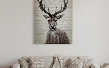
A gallery wall is one of the highest-impact, lowest-cost changes you can make to a room. The difference between one that looks curated and one that looks chaotic comes down to spacing and an invisible line.
Start with the rule that governs all six
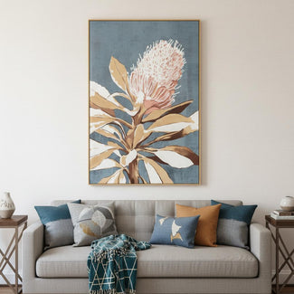
Hang art so the center of the arrangement sits at 57 to 60 inches from the floor — gallery height, roughly average eye level. Above furniture, leave 6 to 8 inches between the top of the sofa and the bottom of the frame.
Keep 2 to 3 inches between frames. Consistent gaps are what make a mixed collection read as one piece.


1. The grid
Identical frames in even rows and columns. The most forgiving layout to hang and the most formal to look at — perfect for a set of botanical or architectural prints.
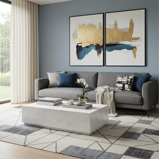
2. The pair
Two large pieces side by side above a sofa or bed. Understated, fast, and nearly impossible to get wrong.


3. The anchored cluster
One large piece, with smaller works radiating around it. Hang the anchor first, then build outward, keeping your spacing consistent.
Lay the whole arrangement on the floor before a single nail goes into the wall.
4. The ledge
Picture ledges let you lean and overlap art, and swap it whenever you like without patching holes. Renters, this one is for you.


5. The staircase line
Follow the angle of the stair with a consistent gap between each frame and the nose of the step. Align the centers along the diagonal, not the tops.
6. The salon wall
Floor-to-ceiling, mixed frames, mixed sizes, tight spacing. It takes the most nerve and the most pieces, and in a dining room or stairwell it is unforgettable.
Shop the look
Over six thousand prints, canvases and framed pieces to build with.